Lake Gardner
BRAND IDENTITY | PRINT DESIGN
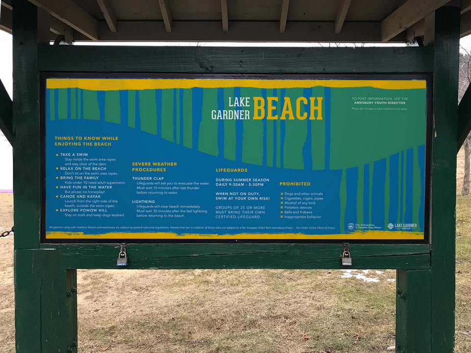
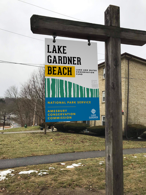
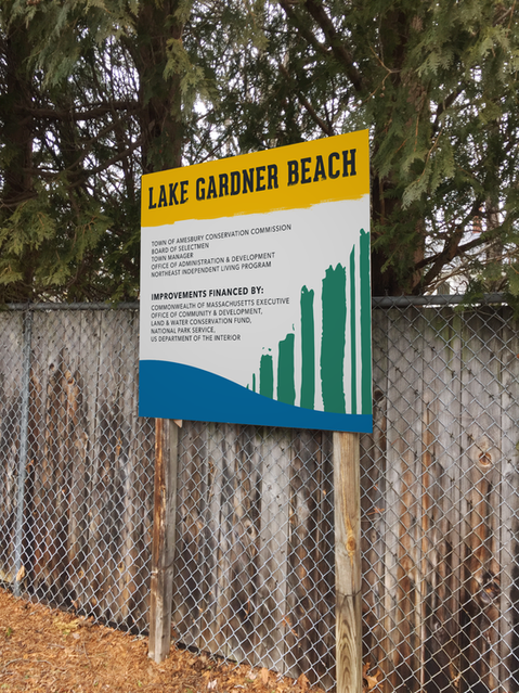
Like many local landmarks, the traditional branding for Lake Gardner (a beloved spot in Amesbury, MA) was plain and old-fashioned. The muted style felt too "cold" and "corporate", which clashed with the freshness and spirit of the area. This called for a full rebrand: from the logo to the supplementary marketing materials (signage, brochures, and merchandise).
FINAL LOGO

WORKING VERSIONS

The brand's redesign is rooted in the very feeling of being outdoors— natural, rugged, free-form. It incorporates prominent visuals from the area like the reflection of still water, the arch of Powow Hill, even the compelling irregularity in the silhouettes of the trees.
The energetic combination of horizontal and vertical lines represents the effortless merging of the greenery and water and the playfulness of the recreation area.


